Countdown to Better Libraries: 12 Missteps to Avoid (Part 3)
User Experience & Access
Your library can have updated finishes, modern furniture, and state-of-the-art technology — but if patrons can’t easily enter, navigate, and understand the space, none of that matters.
Too many renovations focus on how a library looks instead of how it works for the people who use it every day. The final four missteps in our “Countdown to Better Libraries” series address the critical areas of access, navigation, inclusivity, and real-world user experience.
These are the details that determine whether a library feels welcoming or intimidating, intuitive or confusing.
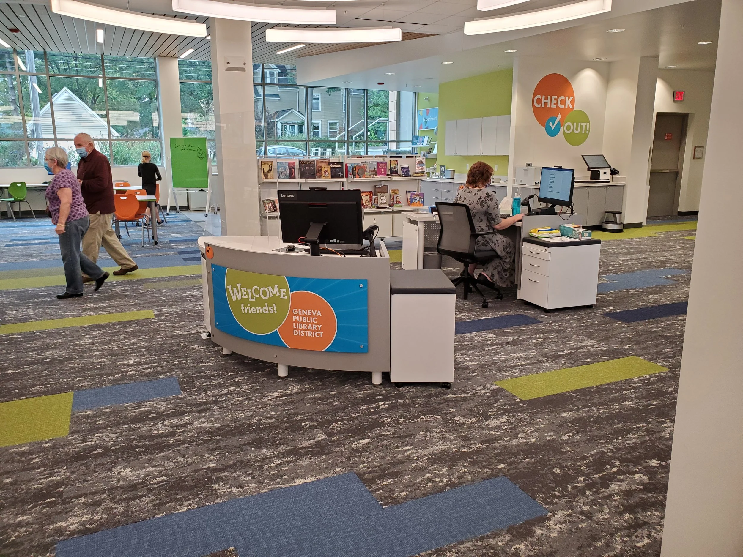
Misstep #4: A Confusing or Unwelcoming Entrance
What goes wrong:
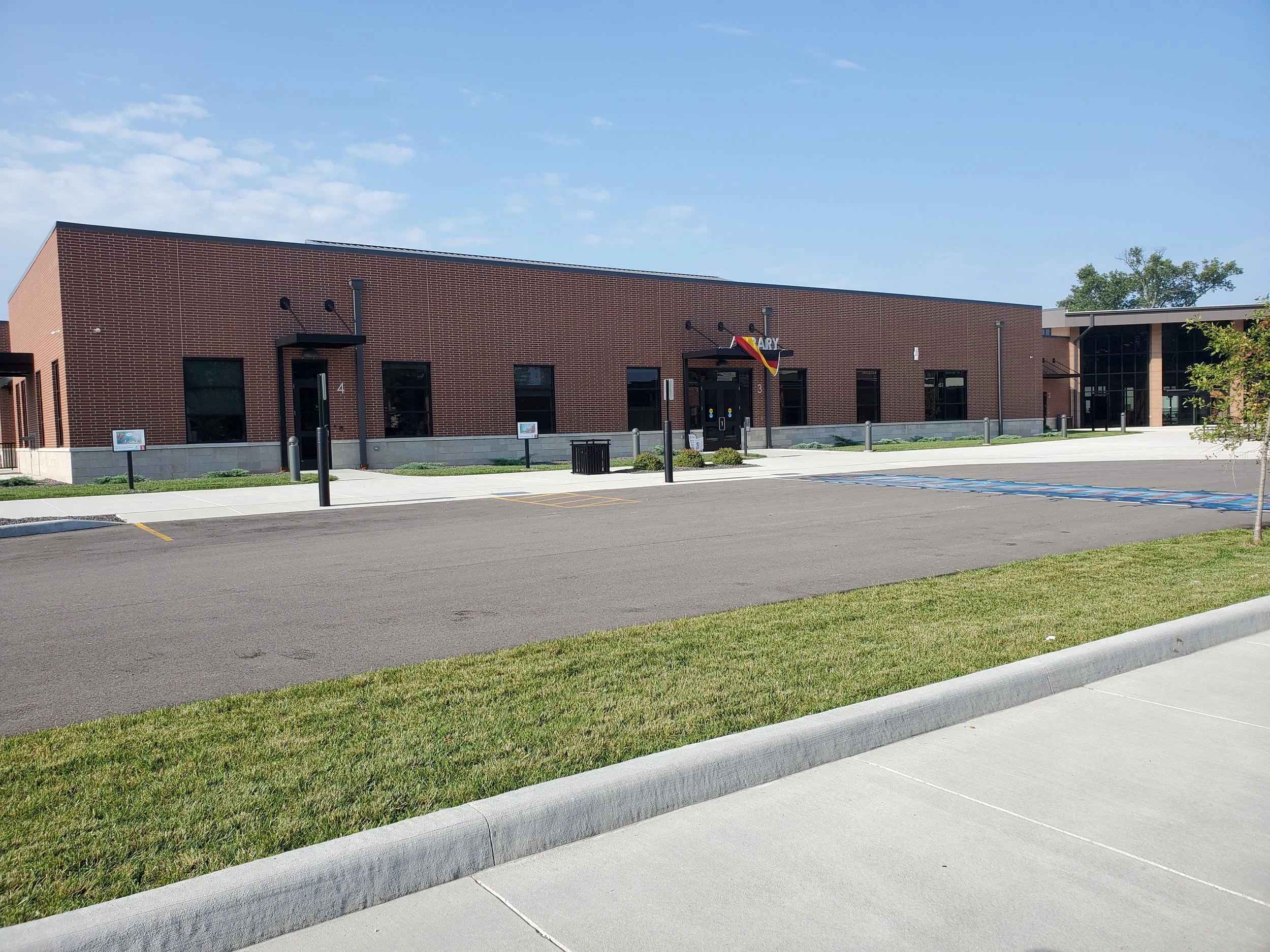

The entrance sets the tone for the entire library experience. If it’s hard to find, difficult to access, poorly marked, or visually uninviting, people begin their visit feeling uncertain or unwelcome before they ever reach a service desk.
Common problems include lack of visibility from the street, poorly placed doors, confusing layouts, overwhelming signage, and insufficient space for strollers, mobility devices, or groups.
Smarter choice:
Design an entrance that is easy to see, easy to reach, and easy to understand. Use clear signage, simple pathways, good lighting, and intuitive flow. Think of your front door as your first service point — it should immediately communicate, “You’re in the right place.”
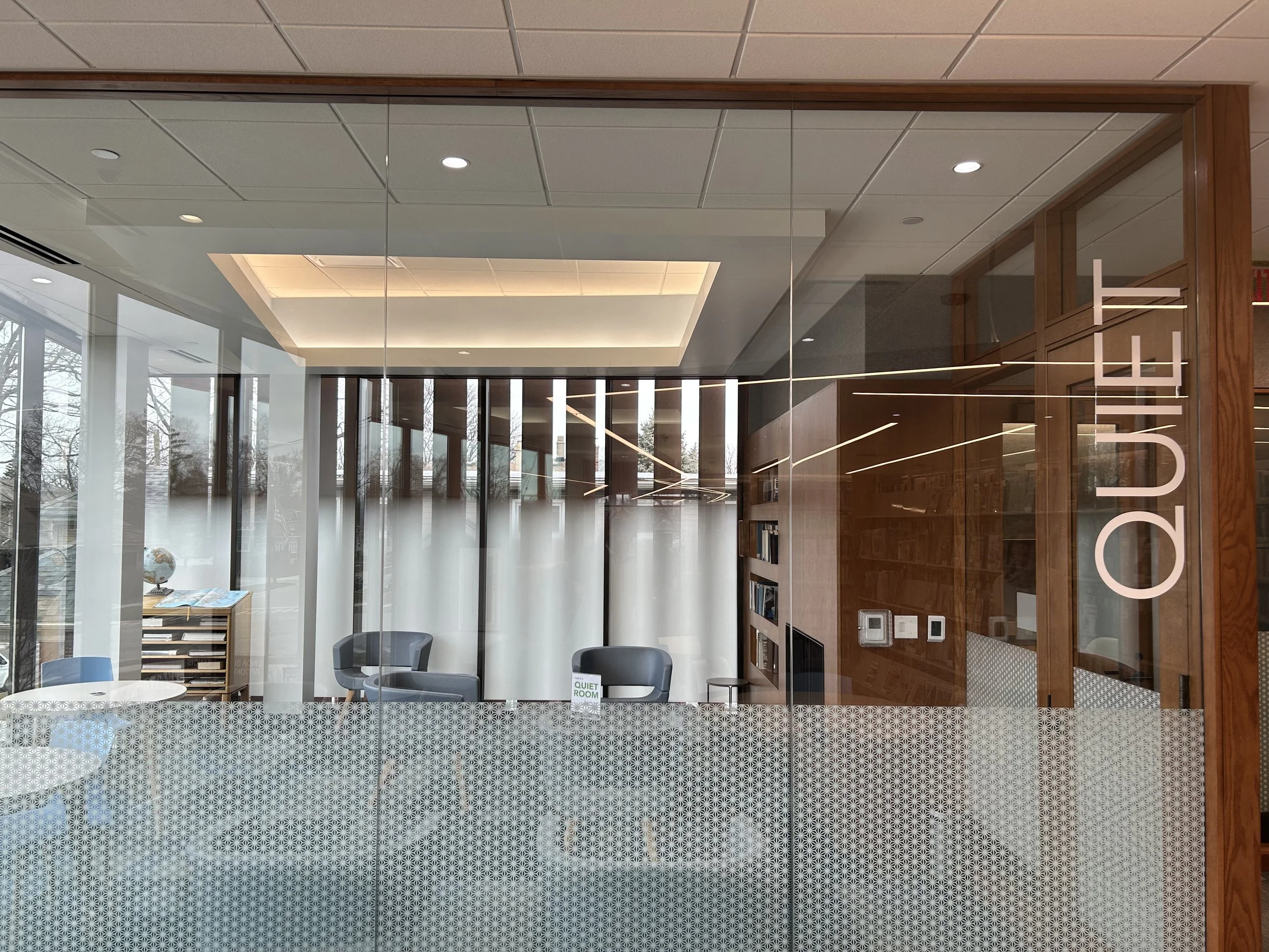
Misstep #3: Poor Wayfinding and Inconsistent Signage
What goes wrong:
When patrons need to ask for directions multiple times, signage has failed. Inconsistent language, cluttered signs, and overly complex directories add frustration — especially for first-time visitors, non-native language speakers, and people with cognitive or visual challenges.
Libraries often underestimate how disorienting large or redesigned spaces can be.
Smarter choice:


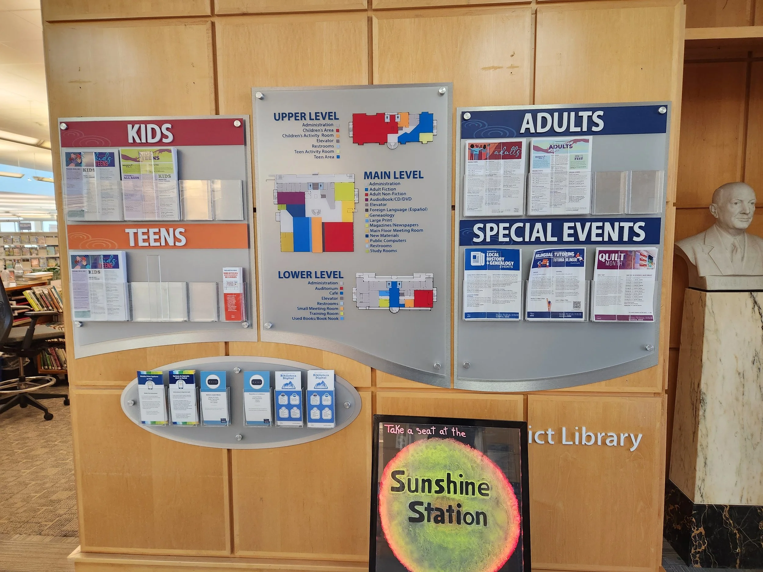
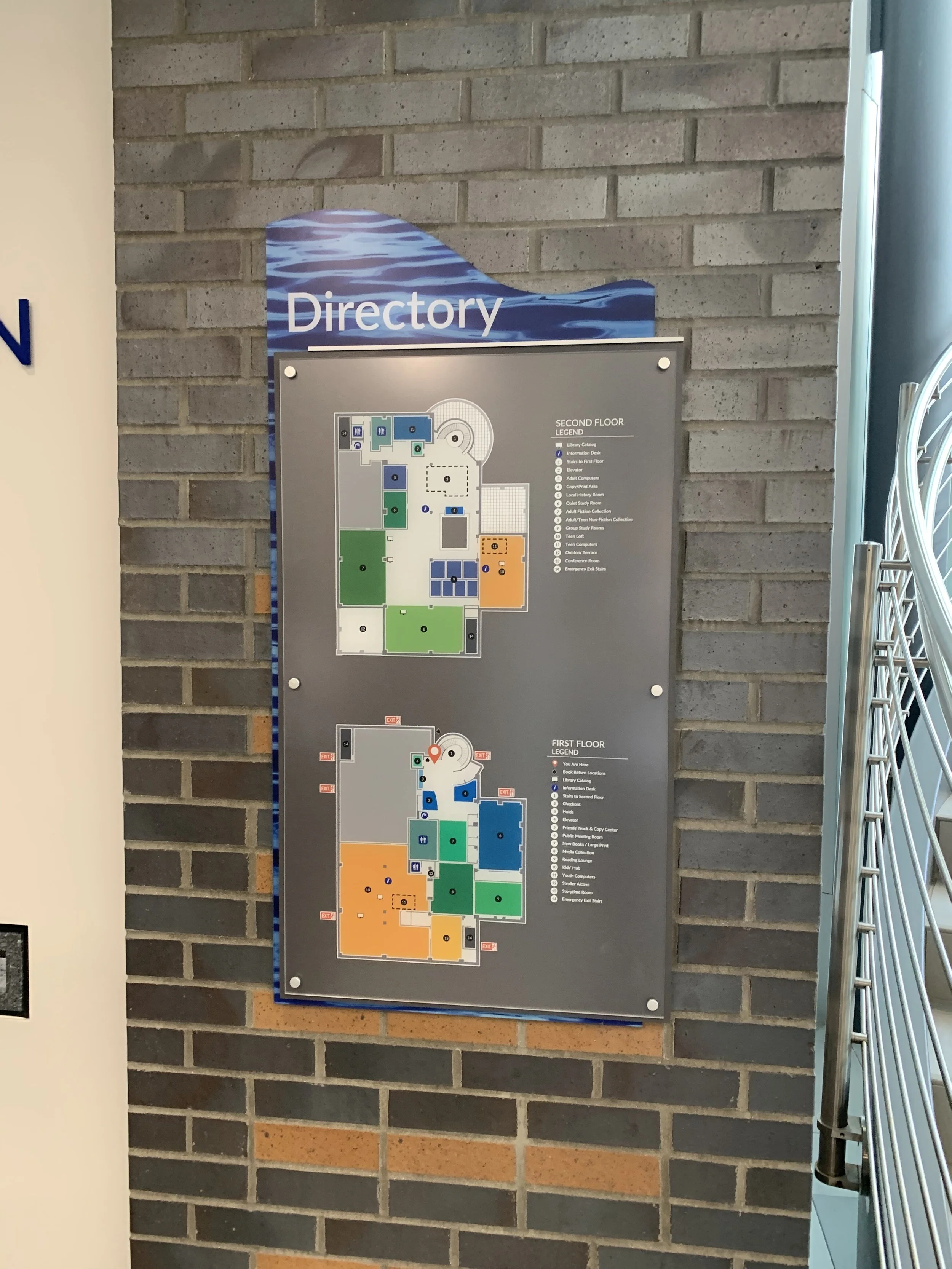
Keep signage simple, consistent, and minimal. Use universal symbols where possible. Support multiple literacy levels and languages. Ensure that a person can walk in and intuitively understand where to go next — without needing to rely on staff for constant direction.
Misstep #2: Designing Without Considering All Ability Levels
What goes wrong:
Accessibility is not just about meeting code — it’s about genuine usability. Designs that ignore physical, sensory, cognitive, or neurodiverse needs limit who can truly use the space.
This can show up in aisles that are too narrow, furniture that’s hard to use, unclear layouts, poor contrast for low vision users, or sensory overload in high-traffic areas.
Smarter choice:

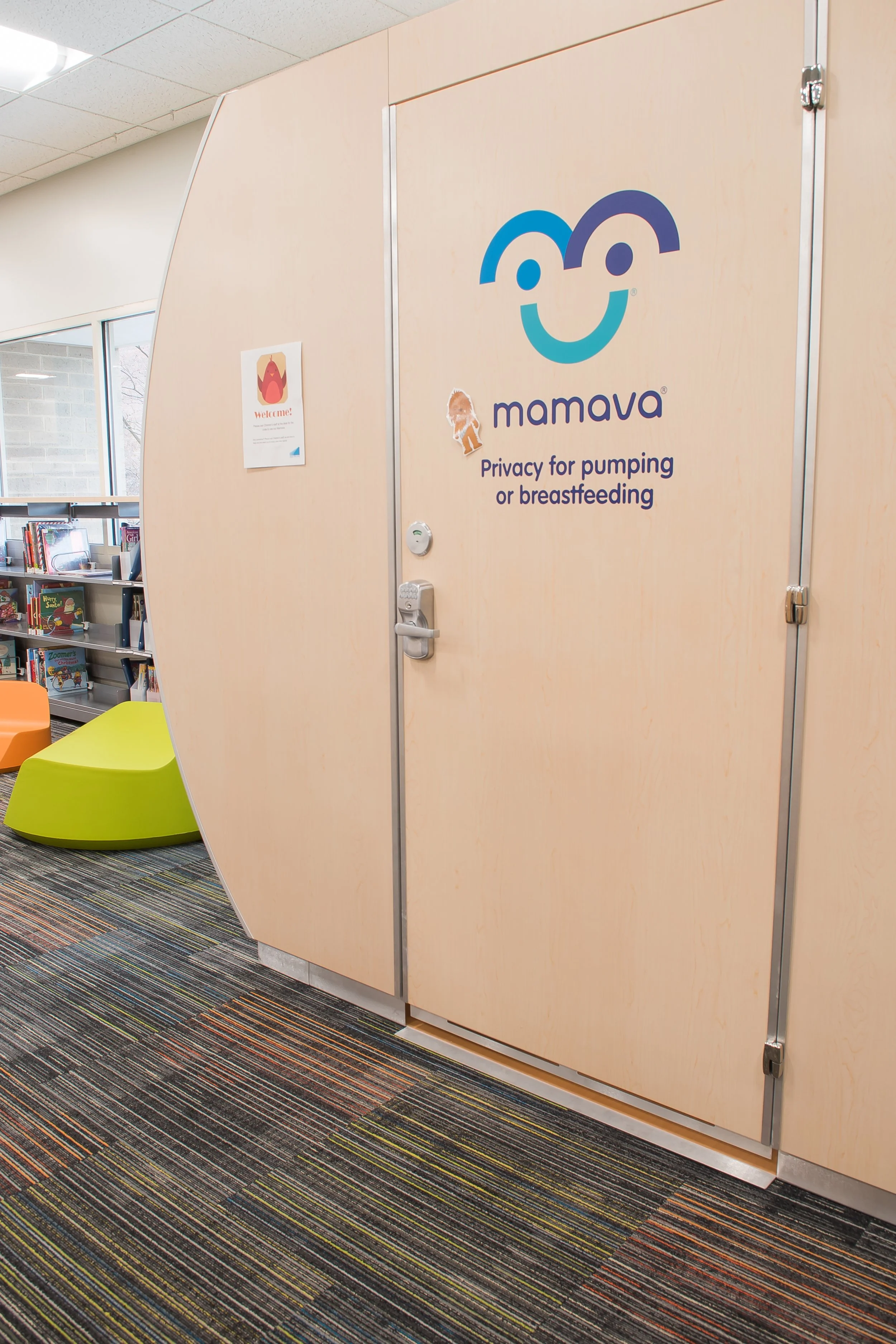
Adopt universal design principles from the start. That means planning for a wide range of abilities, ages, and needs — including those that may not be visible. The more inclusive your design, the more welcoming your library becomes for everyone.
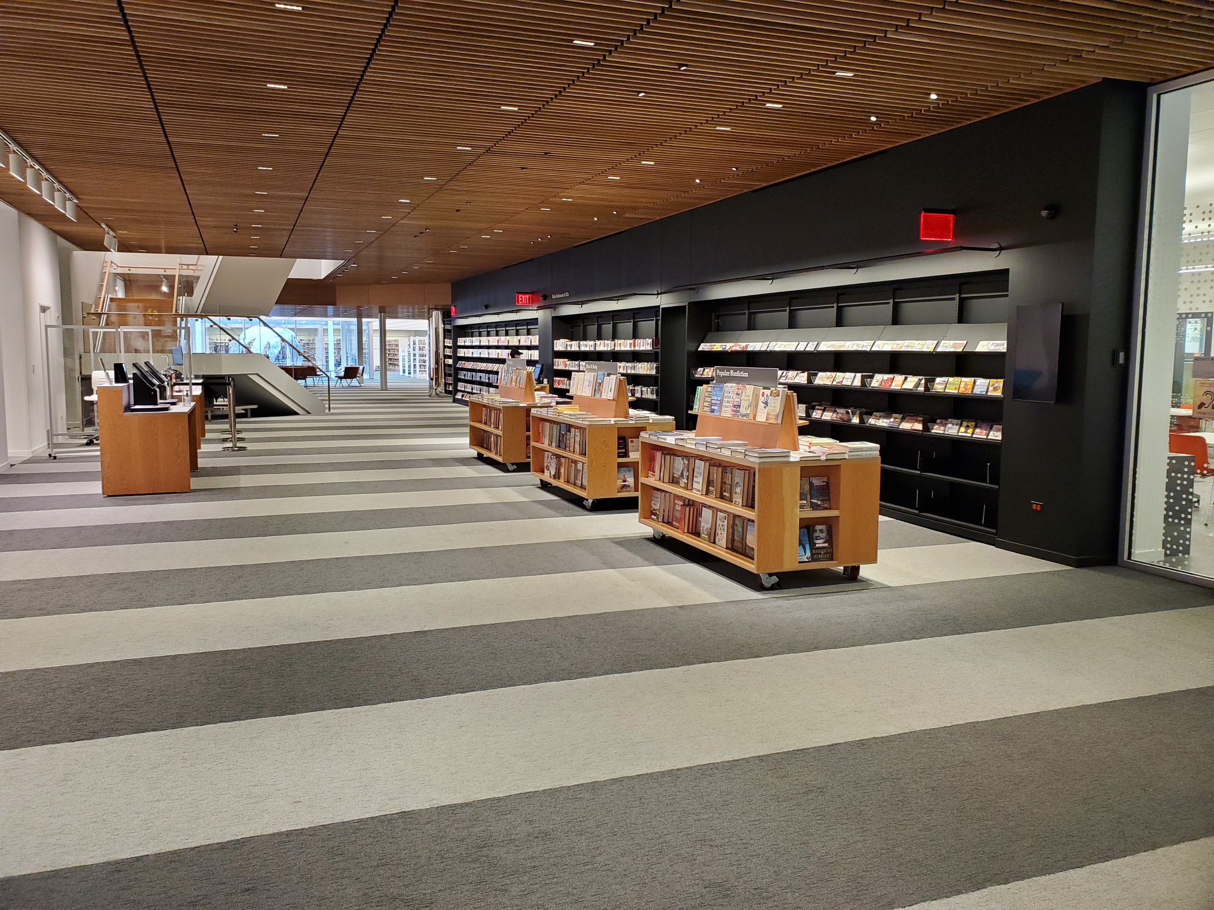
Misstep #1: Forgetting to Observe Real User Behavior
What goes wrong:
The biggest misstep of all: designing for an imagined user instead of the real one.
When planning happens without observing how people currently use the library, where they linger, what they avoid, and how staff actually work, the final result often misses the mark — no matter how beautiful the finished building is.
Smarter choice:
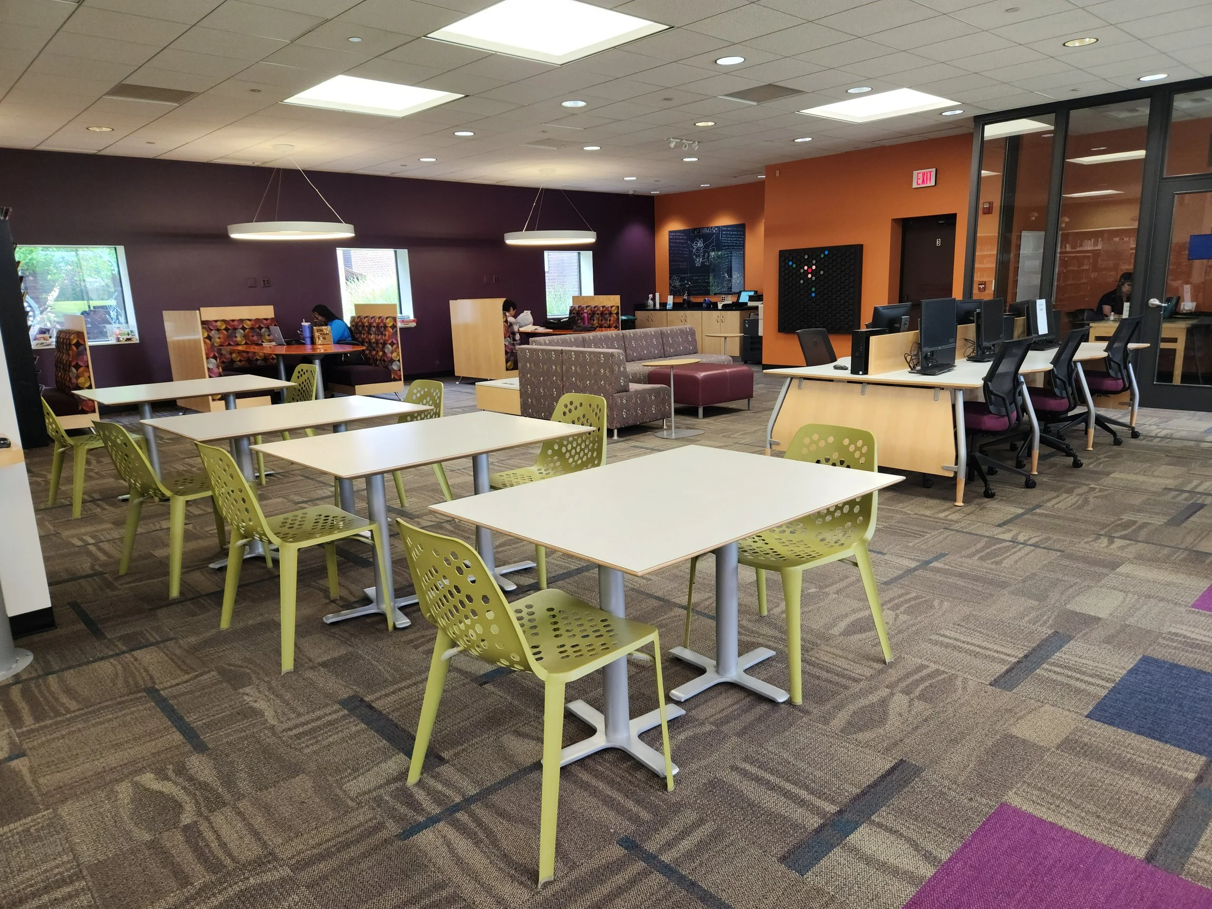


Let user behavior guide design decisions. Look at traffic patterns, seating preferences, bottlenecks, informal gathering spots, and staff movement throughout the day. Gather input through surveys, informal conversations, and observation. Your users will show you what they need — if you’re willing to watch and listen.
Design That Works Starts With People
User experience isn’t a trend. It’s the heart of what makes a library effective, welcoming, and essential to its community.
By avoiding these common missteps — and replacing them with intentional, people-centered choices — libraries can create spaces that truly support access, connection, learning, rest, creativity, and belonging.
That’s what “better” looks like in the Countdown to Better Libraries.